When we first ventured into the World Wide Web, it felt like Splash pages were omnipresent. They would usually consist of a large JPEG image with the instruction to “ENTER” or more usually, a large and often redundant Flash animation with an accompanying “Skip Intro” link. An approach to design and content delivery which left the discerning viewer wondering what was going on.
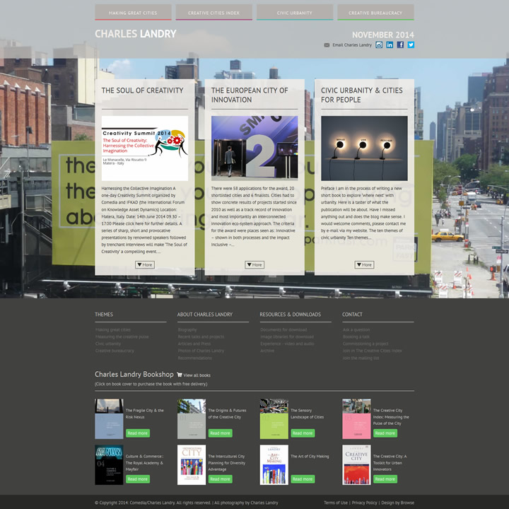
Recently, we were asked by one of our favourite clients, Charles Landry, to build what was effectively a Splash page. As we ran through ideas for the design, we spent some time trawling the web looking at some of our most admired web pages and realised that a form of the splash page has quietly been creeping into our consciousness.
With the advent of broadband and faster load times and a sea change in design trends which demanded that content was delivered instantly, it seemed that the splash page had long gone. However, it would now appear that a variant on the splash page has been making a bit of a comeback. The current fashion for a certain style of long single page sites usually also incorporates a seemingly redundant teaser header section; an arresting image with the call to action to initiate more often than not, a parallax scroll to finally arrive at the content. While this is undoubtedly fun and to some degree engages the viewer, it does seem like a case of the Emperor’s new clothes; The parallax scroll taking the place of the Flash animation. Only, now there is no skip intro button.
Like all fashions that come around again, maybe the splash page’s time has properly arrived. Technology has advanced and the trend for “Flat design” lends itself to a certain type of viewer interaction. Content such as site navigation can be gently but immediately introduced without the need for a loading graphic. This practice allows the designer to subtly dictate the pace of viewer involvement and dramatically “reveal” the content. It helps with the visual branding of the site and because the viewer is in control, it sets the mood for the interaction with the rest of the site. Somehow, it seems more sophisticated and contemporary.
As we are all focused on user experience and making things easy, isn’t it a good idea to introduce a site or brand by way of these huge headers that work above the fold? They are usually built into the design of the rest of the site and have all that introductory information that we and the search engines are looking for.
These revitalised “splash headers” now make sense; in the hands of talented designers they have been reincarnated into a better, more efficient content delivery tool. They don’t take away our SEO and let viewers know immediately what they are looking at. And if care has been taken in the concept and execution, they deliver usability and above all, they look really good.