While none of us here at Browse consider ourselves master typographers, we are enthralled by the use of type in design. There is something about typography which is endlessly fascinating and continually inspirational. The rigidity and grace of classical letterforms are things of beauty and this attention to detail continues to be apparent in the work of those modern typographers who provide us with the tools to style our work.
Here we list 5 books which we refer to on an almost daily basis. They are almost a random selection from our library and in no way form a definitive list. If they don’t they should all find their way into any designer’s list of books on type or design. The opinions are our own.
1. The elements of Typographic style : Robert Bringhurst.
This is usually considered to be the bible of typography. It is less a technical or historical manual on typography, more a philosophical insight into the language of type. An extraordinary range of topics are covered within The Elements of Typographic Style. Here the history of typography and the visual representation are intrinsically linked and therefore typographic understanding relates to both elements. Bringhurst often brings humour to the text and by breaking the text into small sections gives the reader time to absorb the information. The book design itself echoes Bringhurst’s appreciation for form and layout; clear and uncluttered.
2. Pioneers of modern typography : Herbert Spencer.
This book has been the encyclopedia of Avant Garde typography for many decades. Featuring such inspirational pioneers as El Lissitzky, Theo van Doesburg, Alexander Rodchenko and Jan Tschichold. The book documents the rise of this movement from the the publication of Marinetti’s Futurist manifesto to New Typography. It is allegedly the book that most influenced Peter Saville and his work for Factory Records.
Without a doubt Spencer knows the subject of modern typography well. He was the editor of Typographica, The Penrose Annual, art director of Lund Humphries and a professor of graphic arts at the Royal College of Art from the late 70s to mid 80s. The influence of this book and the work it contains can be seen everywhere and it is a fascinating journey to discover the roots of modern typography.
3. The end of print : David Carson.
If Neville Brody and Peter Saville defined the typographic landscape of of popular culture in the 1980s, David Carson conquered the 1990s with his unconventional approach to page design, using distorted type and fragmented imagery that played with notions of legibility – particularly during his tenure as art director of Ray Gun.
His work was never easy but it crossed over into the edgier parts of the mainstream conciousness through his still recognisable work with Pepsi, Nike, Armani, Levi’s, Sony and MTV. While the approach outlined in The End of Print is very much of its time, the insight that the book provides into the iconic surfer/designer’s process is unrivalled.
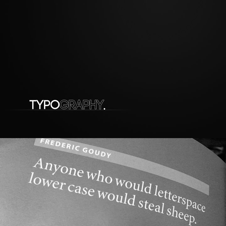
4. Stop stealing sheep and find out how type works: Erik Spiekermann.
A typographer, designer and lecturer at University of the Arts in Bremen, Spiekermann collaborated with E.M. Ginger in order to produce this fun but authoritative text. In contrast to many textbooks on typography Spiekermann provides a down-to-earth approach to type and layout design. Usefully, in the second edition information on screen design for internet as well as print is covered. Aimed primarily at the novice typographer, this book is an informative read which provides an alternative perspective, interspersed with humour.
5. Logotype : Michael Evamy.
If there is one logo design book that we continually flick through it would be this. It comes close to being the definitive modern collection of logotypes, monograms and other text-based corporate marks. It is described as one of the most indispensable handbooks for every design studio and provides a valuable resource to draw on in branding and corporate identity projects. Unsurprisingly it features outstanding work from design giants such as Pentagram, Vignelli Associates, Chermayeff & Geismar and the inimitable Wolff Olins.
What really comes across is the sense that there is something particularly challenging and pleasing in trying to create a strong logo that mostly consists of type without additional graphics to distract from the beauty and purpose of the letters.