This is an ongoing series of random essays and musings on the broad subjects of art, design and music. They are opinions formed over 30 years of working in that grey area where creativity intersects technology.
A couple of weeks ago while having lunch in a restaurant in Loja, I spotted these Coca-Cola bottles on the bar. Not having seen them before, I asked if I could have a closer look and the manager gave me a bottle to take away. I realise that I am somewhat behind the curve here as they have apparently been around for a while, Coca-Cola having taken the decision some time ago to market their traditional product to their consumers in a completely different way. Obviously manufactured with an eye towards the modern ideal of convenience in everything, these allow you to add a touch of cocktail sophistication to your liquid spirits with the minimum of effort. In a calculated ploy to schmooze their consumers, their marketing department puts it a little more grandly:
“We not only wanted to elevate our brand but also to provide choices that pair with and enhance the drinking experience of premium dark liquors. We also realized that in order to create something super sophisticated, we needed to look outward and partner with some of the world’s most innovative mixologists from across Europe in order to gain insights into what consumers really want and how we can offer the ultimate choice in the bar or at home.”
The design detail which is interesting is that this product is contained in a sleek Hutchinson glass bottle. Coca-Cola’s shapely Contour Bottle is instantly recognisable and is the first bottle design ever to be registered. However, when they were introduced in 1906, the original Coca-Cola bottles were straight-sided and sealed with Hutchinson Stoppers. These proved problematic and were replaced with crown caps as they became available, for this reason the straight-sided Coke bottles are still known as Hutchinson Bottles. With a degree of taste and insight, this bottle was re-introduced by Coca-Cola in 2019 for the Signature Mixers range and cashes in, not for the first time, on the wave of nostalgia which surrounds the Coca-Cola brand.
The first step that must be taken in order for a company to create a solid brand identity is to think about the problem that your company solves and how to best communicate it with your audience. The goal in defining your brand strategy is to find a way to subtly communicate with your audience in a conversational manner and create a two-way dialogue where your customers can have their voices heard.
Here, Social Media is the key to dialoguing with your customers, obtaining valuable feedback and promoting your brand. Social Media is also an invaluable tool to use in conjunction with your branding to encourage confidence and trust in your product/service; If you do experience a one-off issue with a product or service, your customers would be more likely to understand, if your brand ethos proves that you’ll do what it takes to resolve the problem.
When putting together your brand strategy there are 4 key points to consider:
1. Uniqueness
Your branding should set yourself apart from your competitors. To do this, analyse what you do best and consider your target demographic. Use graphics and word choices that clearly reflect your business to your target audience, use your branding to deliver clear messages.
Done correctly, your brand can assist you in getting a stronger foothold in your niche market. Define your unique selling position and consider methods to communicate key messages to your desired audience. Use specific images or phrases to encourage the feel of inclusivity. Let them know the reason your business exists and how it can fulfill their needs. This can connect you to your target audience, engage them and motivate them to buy.
2. Emotional Connections
According to a 2010 study conducted by the world’s largest public relations firm, Edelman, the current Y Generation, also known as the Millennials, consider brand identification almost as important as religious preference and ethnic background when defining themselves online. The power of branding has successfully melded into that of personal identification and emotional connection.
3. Message Delivery
Having strong branding builds trust. This can translate to your newsletters and advertisements achieving a more effective response,resulting in increased business. As people will already be aware of your brand, they will be confident that they will receive value for time spent reading your messages or researching the products that you offer.
4. Consistency
This is the most important aspect of any branding exercise. It is essential to focus on your long-term branding efforts to keep your business consistent. This consistency should be a part of all messages and ingrained in all product lines. Used correctly, It should enhance your business, by adding depth to your company’s presence and allow you to grow via a loyal following.
These key points are the cornerstones of your branding strategy. Once the strategy is underway it is essential to reinforce your brand values with every possible contact you have with both customers and potential customers. Communicate your brand and make sure everything you do reinforces the same message. Use your logo, everywhere!
Review your brand regularly – ask customers for feedback and if your customer’s needs change, your brand and your business may need to evolve to stay relevant. Ask the questions; how does my business, product or service meet my customer’s needs? Ensure your brand is in line with the answers to this question and use social media to keep abreast of current trends in your business arena.
This series of articles on marketing are not intended to be exhaustive or authoritative. They are our observations drawn through our years of experience in design and marketing. Branding is a complex and time consuming undertaking, but one that brings substantial business rewards. If you would like to know more, Mail us to discover how 247 Creative can help with all aspects of branding to help drive your business forward.
We have reached that time of year when people find it necessary to indulge in some retrospective navel gazing and start compiling lists which reflect their choice of the highlights of the last twelve months, be it music, film or any other cultural phenomena. Here at Browse we are not averse to these activities but feel that such lists which by their very nature are arbitrary and restrictive, offer at best a very constrained view of a changing cultural landscape. The music or film being referenced can only be judged through a very narrow chronological window and against the shifting sands of taste and fashion. In reality, these lists serve little purpose except to demonstrate that the writer is in tune with the current cultural barometer
When it comes to music, the indulgent practice of personal listings of all-time favourite tracks can be equally disingenuous. George Orwell noted that autobiography can only be trusted if it revealed something disreputable about the author, and so it is with such lists. If a man is to be judged by the company that he keeps, so it is believed that his musical choices impart a perceived sense of cool or urbanity.
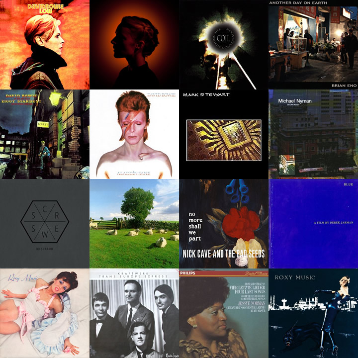
It is acknowledged that I am not immune to such musings and so after some discussion decided to look at musical lists from a different angle. The subject here is 16 albums which I would find it difficult to live without. A conceit which is subtly different to favourite or critically acclaimed. There is no objectivity here, just a collection of albums which I really like, have enriched my life in some way and are never far away from either my home or office music systems. In no particular order they are:
Aladdin sane – David Bowie
Ziggy stardust – David Bowie
Low – David Bowie
Another day on earth – Brian Eno
The angelic conversation – Coil
No more shall we part – Nick Cave & The Bad Seeds
Roxy Music – Roxy Music
For your pleasure – Roxy Music
Trans Europe Express – Kraftwerk
Screws – Nils Frahm
Decay music – Michael Nyman
Aventine – Agnes Obel
Chill Out – KLF
Four Last Songs – Richard Strauss
Blue – Derek Jarman
Mark Stewart – Mark Stewart
Perhaps there are no great surprises here, reflecting as they do growing up through the seventies and eighties. There are the obvious Bowie choices of Ziggy Stardust and Low, the complementary Roxy Music albums and the logical progression to Eno and Kraftwerk and the free form ambient doodlings of the KLF. The anarchic dub noise of Mark Stewart is the perfect distillation of the legacy of punk and generated an interest in dub through Adrian Sherwood’s On-U Sound. A concession to the contemporary mainstream can be found in Agnes Obel and Nils Frahm whose neo-classical influences are reflected in the Michael Nyman and Richard Strauss works. Although all of these albums have a lasting place in my heart, the Coil and Derek Jarman pieces are perhaps the most personal; their haunting beauty and ethereal experimentation draw me to them repeatedly. Maybe it is because the Coil boys and Derek Jarman are no longer with us, or maybe because between them they served as an introduction to a varied and rich sub-culture. One way or another each of these albums contributed a visual or conceptual aspect which informs so much of what we do at Browse.
Of course there are omissions; there is no techno, no metal, no avant-garde experimental electronics. No Cabaret Voltaire, no Faust, no Suicide,no Clock DVA, all worthy and likely contenders for inclusion. The list is ever expanding.
Since music became “popular” there has been an exponentially growing source of available content. Some of it is brilliant, some of it the sonic equivalent of wallpaper and some, just irritating. Whatever our personal tastes it is important to acknowledge that music plays an important part in shaping how we experience the world. This is a subject beyond the scope of this post but these lists serve to connect us via our shared experiences.
Even allowing for the fact that Mad Men is a show about the gloss of marketing, without a doubt, this clip is one of the most powerful 3 minutes of television ever created.
We would expect that you are already familiar with the characters of Mad Men as this programme is essential viewing for anyone who has pretensions to creativity and/or working in advertising or marketing. Supposedly taking place roughly in October/November of 1960, Don makes this pitch after he is asked to come up with a new advertising angle for Kodak’s ‘Wheel’ projector. The pitch is made towards the end of the episode and is inspired by a late encounter between Don and Harry where they speak about the latent power of photography and the power behind each photo.
Don has to make a pitch to the executives at Kodak that will allow them to sell the ‘wheel’, as it is known up to this point, that spins around on the top of the slide projector and allows you to show one slide after another. They see this wheel as an exciting new technology; in an era of excitement over new technologies. It is a time when people are being launched into space, huge advances are being made in science and medicine and American optimism is riding high on a wave of consumer confidence and affluence. The challenge is how to market the oldest technology that exists? How to market something as a technological breakthrough when it also represents something that was mastered thousands of years ago?
The key to Don’s presentation is the power of nostalgia. Don creates a beautiful twist when pitching this advert. He creates a relationship with the Kodak executives, he shows photos of himself and his family in the past, while also verbally seducing the executives and the audience in the pitch.
The carousel scene made such an impression. Shown towards the end of season 1, it encapsulates not only the themes and storylines of every character in the first season, but also the different layers that the series taught us to look out for.
Viewed in the cold light of day, this scene can be viewed merely as dramatic schmaltz (albeit of a very high calibre) or brilliant television; one of those rare moments in the best television dramas which demonstrate what can be done when real talent is harnessed. The viewers of Mad Men ‘buy’ the scene for its straightforward, raw emotional power, or they choose to see it as the ultimate on-screen manipulation.
Branding is more than just a logo or a cool graphic placed at the top of your web page. When considering your brand, you really want to consider your entire customer experience; everything from your logo, your website, your social media experiences, the way you answer the phone, to the way your customers experience your staff. In short, your brand is the way
your customer perceives you.
To achieve this it is critical to create the brand experience that you want your customers to have. A good brand doesn’t just happen; it is the result of a well thought out and strategic plan. Many small businesses neglect their brand and the impact it has on their business because they feel it is not important and will not translate into extra sales. Let’s look at 10 simple reasons why having a brand strategy is important:
1. Branding promotes recognition.
People tend to do business with companies they are familiar with. If your branding is consistent and easy to recognize, it can help people feel more at ease purchasing your products or services. Unified branding across every aspect of your business makes your customers feel comfortable as they will feel that they are dealing with an established and solid company.
2. Your brand tells people who you are.
Your full brand experience, from the visual elements like the logo to the way that your phones are answered, tell your customer about the kind of company that you are. All these elements should point to a unified presentation. At every point of contact with your business, your customer should be in no doubt who they are dealing with and what your company represents.
3. Your brand helps set you apart from the competition.
In the modern global market, it is essential to stand out from the crowd. You are no longer competing on a local stage, your business is competing in the global economy and as such the branding communicates core cultural values and geographic locators.
4. A strong brand helps customers know what to expect.
A brand that is consistent and clear puts the customer at ease, because they know exactly what to expect each and every time they deal with your company or its representatives and experience the brand.
5. Your brand provides motivation and direction for your staff.
A clear brand strategy provides a very useful management tool insofar as it gives your staff clarity and guidance on how to act and how to meet the goals of your business. It also helps to promote a healthy team spirit and a focussed and positive attitude.
6. A strong brand generates referrals.
People love to tell others about the brands they like. People wear brands, eat brands, listen to brands and they’re constantly telling others about the brands they love. A strong brand is critical to generating referrals or viral traffic.
7. Your brand represents you and your promise to your customer.
It is important to remember that your brand represents your business. What do you, your staff and your marketing materials say about your company, and what you’re going to deliver to the customer?
8. Your brand helps you create clarity and stay focused.
A clear brand strategy helps you stay focused on your mission and vision as a business. Your brand can help you be strategic and will guide your marketing efforts saving time and money.
9. Your brand helps you connect with your customers emotionally.
A good brand connects with people at an emotional level, they feel good when they buy the brand. Purchasing is an emotional experience and having a strong brand helps people feel good at an emotional level when they engage with the company.
10. A strong brand provides your business value.
A strong brand will provide value to your business beyond the physical assets. Think about the brands that you purchase from (Coca-Cola, Apple, Ford); are these companies really worth their equipment, their products, their warehouses, or factories? Their brand has created a value that far exceeds their physical value. Not every business will become the next global multi-national, but a strong brand drives customer’s perceptions of your company and the product or service that it offers.
If you are interested in growing your company’s brand email us and we will look at how we can help.
We have asked before why do we think that design is important. Principally, it is because design presents your public image and dictates the perceptions, unconscious or otherwise, that your audience will have of you.
It is more than likely that the first thing that will grab the attention of a potential customer is a website or advert, leaflet or brochure, point-of-sale display or even product packaging. All of these rely on effective, appealing, graphic design.
Based on the scientific research study “Trust and Mistrust of Online Health Sites”, the conclusion is that good website design does have an impact on whether visitors trust your website. In this study reseachers posed the question; “Do different design and information content factors influence trust and mistrust of online health sites?“ and although this is a study of health websites specifically, the resultant findings can be applied to just about any business website.
Of all the factors that were mentioned for rejecting or mistrusting a website, 94% were design related; only 6% were content related. What this means, is that when deciding whether or not they trusted a website, participants mentioned design related issues 15 times more than content related issues.
Some of the design-related reasons participants mistrusted websites:
Complex, busy layout – Unusual layouts were cited as being less trustworthy. Participants were looking for an easy-to-read and expected layout.
Boring web design (especially use of colour) – One of the participants had this to say about a mistrusted website, “And one of them I didn’t like the color of. I couldn’t wait to get out it was an insipid green backdrop it just put me off reading it.”
Pop-up advertisements – Most people find pop-up ads annoying. And this study points out that they also hurt your website’s credibility. If your company relies heavily on being trustworthy (home security, financial institutions, etc.) Avoid pop-ups.
Slow introductions to the website – Besides being clunky and slow, website intros can make web visitors hit the back button.
Small print – Content is the lifeblood of your website. It’s what people are looking for. So don’t hide it. Make sure the content on your website is easy to read.
When participants were asked for reasons that they mistrusted websites, design was the most-cited reason. However, when asked for aspects of websites they trusted, content factors were mentioned 83% of the time.
Participants trusted sites with:
Informative content
Relevant illustrations
Wide variety of topics covered
Unbiased information
Age-specific information
Clear, simple language used
Discussion groups
Frequently asked questions
This would imply that websites with bad design will be dismissed quickly, even if the content is good. Yet, if the design is good, it goes almost unnoticed, with visitors focusing on the content instead.
Here’s a direct quote from the study:
“The look and feel of the website was clearly important to the participants. Visual appeal, plus design issues relevant to site navigation appeared to exert a strong influence on people’s first impressions of the site. Poor interface design was particularly associated with rapid rejection and mistrust of a website. In cases where the participants did not like some aspect of the design the site was often not explored further than the homepage and was not considered suitable for revisiting at a later date… The main reason that websites were rapidly rejected was due to the design of the interface. Design issues affected first impressions and could lead to the mistrust of a website.”
Conclusion: A good website design matters because it inspires trust – visitors will stay longer on your website.
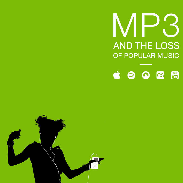
If you were to believe the voice of Apple, the arrival of the iPod was an event which would completely revolutionise our music consumption and listening habits by delivering the convenience of portable digital sound and by so doing, improve our lives immeasurably; a constant bitstream of audio data acting as a universal panacea for all our ills. Magically, our lives would be better, happier and full of spontaneous joy.
Of course, in many ways it has changed the way we listen to and experience music, but this has not always been to the consumers’ advantage. The most glaring omission from the whole marketing campaign of any MP3 download service or MP3 device is the use of the word “quality”. Indeed the sound quality of music stored as MP3 and its subsequent playback is seen as being quite low down the list of perceived benefits. Content is sacrificed on the contemporary altar of convenience.
Since 2007, iPods have had a maximum capacity of 160Gb: apparently enough for 40,000 watered-down songs. In Apple’s own words, that amounts to a lifetime’s entertainment. However, that is a lifetime of low quality entertainment. I would suggest that the music fan deserves more. Given the advances of technology in the intervening years, Apple could easily have increased the capacity of their iPods, but 8 years of silence on this matter suggests they are really not that bothered about improving the quality of their offering.
Of course, this wouldn’t be so bad if it wasn’t for the collusion of MP3 download services such as Amazon and of course, Apple’s own iTunes services which restrict the bit rate to a miserly 256Kb instead of the maximum of 320Kb. This could be interpreted as reflecting a thinking on the part of Apple et al that the consumer is too stupid to realise the difference and if they do, then they are too shallow to part company with their lifestyle accessory; The one that has brought them happiness and spontaneous joy.
Thankfully, however, there are already signs that music quality for the common download is set to improve. There are a number of initiatives that suggest that segments of the industry are thinking about changing the formula.
While Spotify’s audio stream is currently capped at 320Kbps, the maximum bit rate MP3 can offer, it is rumoured that it intends to move to CD quality. Despite the PR debacle and ill-considered technology that was Tidal, the ongoing development of products and services such as Pono make it clear that upward pressure will undoubtedly hasten the eventual demise of MP3 for streaming services.
At the heart of all this is the question of whether there is actually a demand for better quality sound. I am continually surprised by how little people who are under 30 understand about the nature of sound. As consumer electronics in the form of iPods and tablets increasingly keep the details of music reproduction hidden, many listeners have lost contact with how the music goes from its source (digital files or analogue LPs) to actual sound moving through the air. Few aesthetic experiences are as subjective as the sound you hear. The nuances of sound reproduction are, for most people, hard to differentiate and wholly personal. When your iPhone has a retina display with more pixels per inch, you notice it, but what we desire in sound is much more individual. Some people want “accuracy” and some people want a lot of bass. The audiophiles want depth and faithful representation of the sound stage and teenagers only care that it’s loud enough. The portability of modern technology gives you your tablet or your MP3 player/smart phone, into which you plug your headphones and you listen to what comes out. What used to be a contemplative and communal experience manifesting itself as a tangle of variables behind a vintage stereo system in your living room has been turned into an exercise of self centred introversion.
This trend engenders a disposable attitude to music. Before MP3, teenage music fans would value the purchase of each LP or CD and revel in the physicality of the product. You might not have been able to play your brand new copy of Ziggy Stardust on a Linn Sondek but the source product was as good as you were going to get and you could always aspire to a better sound system. Now, the experience for most teen music consumers is a low quality download shared with their friends over the internet. Devoid of any packaging, anything that can be touched and requiring no investment, financial, emotional or otherwise, it is easy to dismiss and discard and move on to the next thing. The result is that musicians lose identity and potential cultural reference points become blurred.
Collecting music in the form of vinyl or CD is so gratifying. The possession of a literal wall of sound and the inherent fetishism in studying the sleeve imagery and notes; a shrine proudly dedicated to your musical predilection. Somehow, an iTunes library seriously lacks the same personality or presence. Nobody ever comes round to your house and thoughtfully thumbs through your downloads. Data files are never a talking point or a subject of envy and Megabytes will never be converted into objects of desire.
One of the great functions that we have seen with popular music over the last 50 years is its ability to bring people together, whether it be at a concert venue, club or party. In the same way, record shops, by acting as a focal meeting point, bring people together who share a similar passion for music, albeit for separate genres. They behave as the physical disseminators of music and associated culture and a place to acquire music in its most original and authentic form. Low quality downloads erode such involvement. iTunes and the other online means of sharing, discussing, or downloading music, result in a level of humanity and personality being removed and hidden behind faceless discussion boards and bland generic online “checkouts.”
Does all of this matter? Maybe not. People probably don’t enjoy music any less, but the individual’s involvement with music and its cornerstone as part of popular culture is now seriously compromised.
We cannot blame technology and it is not strictly the fault of music going digital as much as it is the world increasingly going remote. If we want technology to serve us the product we think we deserve, then we need to seriously think about our interaction with our fellow music enthusiasts and how we want to engage with music as part of our shared identity.
The first few sites that we ever worked on back in 2001 – 2002 were websites for artists and art galleries so they hold a certain nostalgic interest for us. For the most part they were fun to do and an invaluable introduction to the growing world of web design. They might not have always offered the most scope for sophisticated web development at the time but they did allow an enormous amount of disciplined creativity in paring down the design to showcase the artists’ work.
Over the years we have refined our techniques for the design and build of artists’ portfolio sites but the most important goals to keep in mind are to keep it fast, simple, easy and organized. We believe that the solid foundations of simple navigation and clean design allied to great photography are key to the successful display of art on the internet.
Although the landscape of the internet has changed beyond recognition, we still do work for some of our favourite artists such as Pippa Blake and Catharine Somerville and below are some of our thoughts for those embarking on a commercial internet presence on what makes a good artist/portfolio website:
It may sound obvious but it is important to register and set up your own domain name and to avoid free or low cost web hosting services. Free web hosting is never free. Your art will be sitting alongside advertising and other uncontrolled content and art never looks good under those circumstances. Crucially, free sites give the impression that either you can’t afford your own website or domain name or worst of all, that you don’t care enough about your own art to bother making it look good online. Marketing is everything and art like any other commodity benefits from a little positive promotion.
If you are already immersed in the world of social media make sure that your website is linked to all of your social networking pages (and vice versa) so that visitors can easily and seamlessly navigate between them. If maintained and managed correctly, social networking websites have evolved into one of the best tools for driving traffic to your website. However, it is important to remember that your website is all about your art and social networking sites are geared to reflect who you are as a person. It is important to work out beforehand how the content of these two media will complement each other.
It is important to think about how you present yourself and your art on the internet so that anyone can easily understand and share your artistic vision. Visitors who land on your site by chance or referral should be able to quickly see what it is you do and feel that they can relate to what is being expressed. Clearly, this comes down to both the site design and the nature of the art. They should complement each other, but the site design should not detract from the content.
Artist websites are one area on the web where it generally pays to keep text to a minimum. This includes your artist statement, biography and any lengthy explanations of medium or techniques. Concise introductions and descriptions are recommended where possible. If it is felt necessary to provide detailed information about either yourself or your art, link to informational pages where people can read more and they will not be distracted by imagery. However, it is important to think seriously about accompanying each series or body of your work with its own introduction. Keeping any content brief, a short explanation deepens people’s understanding and experience of the work. This is useful from an SEO perspective; Google and other search engines cannot search images but they can search text. Providing textual explanations of your art, either accompanying groups of similar works or even of individual pieces, increases the chances that they will be found and indexed and thereby increase your site ranking.
Keep image file sizes as small as practicable. Large detailed images of your art may look great when they download over high-speed connections, but remember that many people still have slow broadband speeds. Long download times frustrate visitors and drive them away from your site. Again, this is a design issue and a workable compromise can always be found.
Remember to provide adequate contact information. The more detail you give such as your studio address, a mobile phone number, email address or other contact points, the more accessible you appear. Don’t give potential buyers the impression that you’re hard to communicate with by not telling them how to find you or by just giving your email address. Anonymity is not a selling point. It allows your market to engage with you and feedback from your audience can be a very useful tool.
Selling your art: If you have no long-term gallery representation and you want to sell your work, price every piece of art on your website for sale. If you have representation, discuss options and preferences with them regarding whether or not to put prices on your website. Generally, not pricing your art on-site and asking people to email or otherwise contact you for prices, is always a big mistake. More than other online purchases, people prefer to shop for art quietly by themselves, decide whether they can afford it and then make contact. Above all, provide clear concise instructions on how to buy. Tell people what payment options you accept, how you pack and how you ship and where to. The more professional you appear, the more comfortable people will feel about buying from you.
Don’t show too much sold art. Some artists think that showing numerous sold works of art will make them look popular and incite some kind of buying frenzy. This usually has the opposite effect of making potential buyers think that the best pieces are already sold and all that’s left is the least desirable. We would usually advise to show sold works in a section titled “Selected Past Works” or something similar. Here for example, you can show any art that’s won prizes or been exhibited in prestigious shows, art that’s in respected private or institutional collections, art that’s been covered in reviews or pictured on websites or in hard-copy publications. Discreetly using past works in this way illustrates and strengthens your credibility as an artist.
Don’t show every work of art you’ve ever created. It is not necessary for your audience to see experimental projects or older pieces that have little or no bearing on what you’re doing now. Too much art and too much variety is confusing to visitors because they don’t get a sense of who you are, what your art represents or is intended to communicate.
Whether or not you want to sell your creativity, it is important to engage with your online visitors. The design, content and functionality of your website will inform their perception of your work. Making it appear professional and accessible to use will improve their experience and generate interest.
The above list is by no means exhaustive and is intended solely as a starting point for those artists thinking about selling their art online. Here at 247 Creative we would be happy to advise on this and any of the points above. The benefits of having a website to showcase your work have been widely discussed elsewhere, but we believe that it is important to realise an artists website should be viewed as the online part of a complete holistic strategy to gain exposure for what you do and want to share with others.
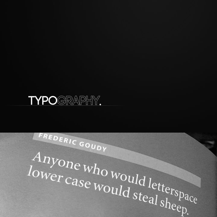
We included this post partly because we thought that you would like to see that we do actually have a sense of humour at 247 Creative. Yes it is slightly juvenile, but it did make us laugh. At the same time it makes a very important point; do not underestimate the importance of kerning.
Kerning is the process of adjusting the spacing between individual letter forms. It’s used in typography to achieve visually pleasing spacing over a range of characters. Modern software programs usually provide an autokerning feature, however, it rarely works that well and is in no way a substitute for kerning by hand and eye.
As can be imagined, most people are totally oblivious to the existence of kerning. If you asked a random person on the street if they knew what “kerning” meant, they would probably have no idea, but you would expect your designers to do so. Proper kerning is usually what separates the work of professional designers from that of someone who has a cracked copy of Word or Publisher on their PC.
After you learn about kerning, your life will change. Suddenly you will start seeing uneven and ugly spacing everywhere which will disproportionately irritate you. Some people, including your friends and family might consider you a nerd or even a bore for bringing it up, but it does actually matter. Careless and inept work of any kind has an adverse effect on all of us. Once poor workmanship is accepted as the norm, then apathy lowers the expectation for any kind of craftsmanship
If only more businesses would recognise the importance of kerning and good type. It would save them from the unnecessary headaches caused by poorly printed business cards, letters, signage, packaging and the other miscellaneous items they’ve gone and designed themselves, just because they thought they could.
Think that you can do better? Here is a great tool which is both instructive and fun. And surprisingly revelatory.
While none of us here at Browse consider ourselves master typographers, we are enthralled by the use of type in design. There is something about typography which is endlessly fascinating and continually inspirational. The rigidity and grace of classical letterforms are things of beauty and this attention to detail continues to be apparent in the work of those modern typographers who provide us with the tools to style our work.
Here we list 5 books which we refer to on an almost daily basis. They are almost a random selection from our library and in no way form a definitive list. If they don’t they should all find their way into any designer’s list of books on type or design. The opinions are our own.
1. The elements of Typographic style : Robert Bringhurst.
This is usually considered to be the bible of typography. It is less a technical or historical manual on typography, more a philosophical insight into the language of type. An extraordinary range of topics are covered within The Elements of Typographic Style. Here the history of typography and the visual representation are intrinsically linked and therefore typographic understanding relates to both elements. Bringhurst often brings humour to the text and by breaking the text into small sections gives the reader time to absorb the information. The book design itself echoes Bringhurst’s appreciation for form and layout; clear and uncluttered.
2. Pioneers of modern typography : Herbert Spencer.
This book has been the encyclopedia of Avant Garde typography for many decades. Featuring such inspirational pioneers as El Lissitzky, Theo van Doesburg, Alexander Rodchenko and Jan Tschichold. The book documents the rise of this movement from the the publication of Marinetti’s Futurist manifesto to New Typography. It is allegedly the book that most influenced Peter Saville and his work for Factory Records.
Without a doubt Spencer knows the subject of modern typography well. He was the editor of Typographica, The Penrose Annual, art director of Lund Humphries and a professor of graphic arts at the Royal College of Art from the late 70s to mid 80s. The influence of this book and the work it contains can be seen everywhere and it is a fascinating journey to discover the roots of modern typography.
3. The end of print : David Carson.
If Neville Brody and Peter Saville defined the typographic landscape of of popular culture in the 1980s, David Carson conquered the 1990s with his unconventional approach to page design, using distorted type and fragmented imagery that played with notions of legibility – particularly during his tenure as art director of Ray Gun.
His work was never easy but it crossed over into the edgier parts of the mainstream conciousness through his still recognisable work with Pepsi, Nike, Armani, Levi’s, Sony and MTV. While the approach outlined in The End of Print is very much of its time, the insight that the book provides into the iconic surfer/designer’s process is unrivalled.
4. Stop stealing sheep and find out how type works: Erik Spiekermann.
A typographer, designer and lecturer at University of the Arts in Bremen, Spiekermann collaborated with E.M. Ginger in order to produce this fun but authoritative text. In contrast to many textbooks on typography Spiekermann provides a down-to-earth approach to type and layout design. Usefully, in the second edition information on screen design for internet as well as print is covered. Aimed primarily at the novice typographer, this book is an informative read which provides an alternative perspective, interspersed with humour.
5. Logotype : Michael Evamy.
If there is one logo design book that we continually flick through it would be this. It comes close to being the definitive modern collection of logotypes, monograms and other text-based corporate marks. It is described as one of the most indispensable handbooks for every design studio and provides a valuable resource to draw on in branding and corporate identity projects. Unsurprisingly it features outstanding work from design giants such as Pentagram, Vignelli Associates, Chermayeff & Geismar and the inimitable Wolff Olins.
What really comes across is the sense that there is something particularly challenging and pleasing in trying to create a strong logo that mostly consists of type without additional graphics to distract from the beauty and purpose of the letters.