Make it big

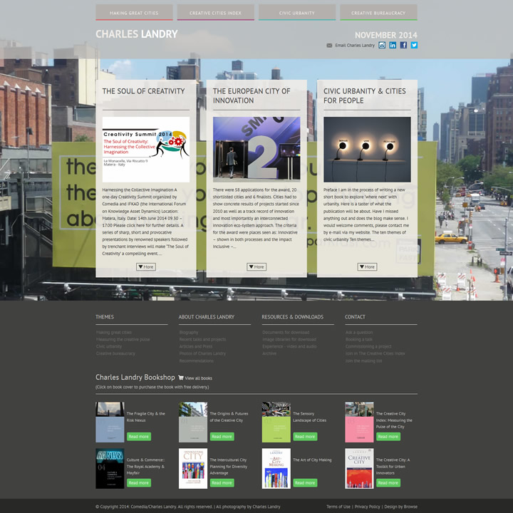
To even the most casual browser of the internet, it is obvious that there are visible trends in web design. Currently it would seem that the notion of “Make it big” is the dominant principle of web design today. However, it is interesting to note that for many designers and those who routinely deal in the language of communication, it is counter-intuitive that the homepage – specifically that content “above the fold” – consists of just a few words placed over an image or a video. Very often, in this current design expression, even the main site navigation is removed or makes an almost token appearance as a small icon.

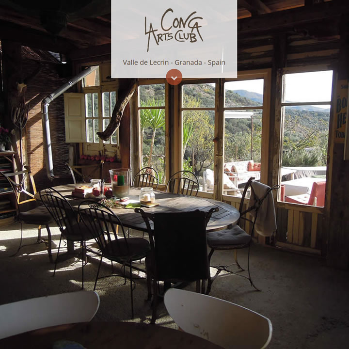
The two main elements of this web design trend can broadly be described as “Cinematic” and “Book Cover”. The first has been inspired by films and Television advertisements, while the second builds on the traditional concept of the printed book and catalogue cover.

The evolutionary reasons for this trend are both visual and pragmatic. A large full screen image gives your visitors maximum impact as soon as they land on your site and with the advent of responsive page frameworks it is easier than ever to code, so it works well across all devices from mobiles and tablets to desktop computer monitors. The result is that however they access your device the user is greeted with an engaging visual hook.

Full screen images are nothing new; this trend has been around almost from the beginning of web design. What has happened is that the technical ability to make it work properly has been refined and made easy to use even for the most inexperienced coding novice. This, allied with with growing access to higher quality images and faster download speeds, not to mention more powerful processors, has resulted in a growing sophistication for this “Book cover” design trend.

The more visually engaging “Cinematic” trend is characterized by a fullscreen video with a few words and/or elements overlaid on top of it. This began to surface in 2013 and most notably, when Paypal updated its whole site design with a homepage utilizing a fullscreen video background. This move by PayPal, a hugely visible corporation, has brought this concept into the mainstream arena and firmly established it as part of the web’s visual language.

Interestingly, what this trend does is reaffirm the old adage that “A picture is worth a thousand words”. More and more, we are seeing websites that have very little in terms of written content; relying solely on captivating images and short written hooks to engage their audience. It would be tempting to write that this visual shorthand is the result of a decline in literacy and the rise of the shortened attention span; combining to pander to the perceived need to “have it all, NOW!”

It is important to note that this increasingly aesthetic emphasis on web design can inadvertently reveal many of the mistakes made in the pre-design phases of a web design project; concept, navigation, wire-framing and copy-writing. Technology and its allied fashions can never replace great ideas and engaging content.

In conclusion, however excited we may get with the new possibilities that technology affords us, we should never forget our mantra of “Content First” and as designers embrace this stimulating challenge to write and visually create concise content in a sophisticated and contemporary manner.

Making a splash

When we first ventured into the World Wide Web, it felt like Splash pages were omnipresent. They would usually consist of a large JPEG image with the instruction to “ENTER” or more usually, a large and often redundant Flash animation with an accompanying “Skip Intro” link. An approach to design and content delivery which left the discerning viewer wondering what was going on.

Recently, we were asked by one of our favourite clients, Charles Landry, to build what was effectively a Splash page. As we ran through ideas for the design, we spent some time trawling the web looking at some of our most admired web pages and realised that a form of the splash page has quietly been creeping into our consciousness.

With the advent of broadband and faster load times and a sea change in design trends which demanded that content was delivered instantly, it seemed that the splash page had long gone. However, it would now appear that a variant on the splash page has been making a bit of a comeback. The current fashion for a certain style of long single page sites usually also incorporates a seemingly redundant teaser header section; an arresting image with the call to action to initiate more often than not, a parallax scroll to finally arrive at the content. While this is undoubtedly fun and to some degree engages the viewer, it does seem like a case of the Emperor’s new clothes; The parallax scroll taking the place of the Flash animation. Only, now there is no skip intro button.

Like all fashions that come around again, maybe the splash page’s time has properly arrived. Technology has advanced and the trend for “Flat design” lends itself to a certain type of viewer interaction. Content such as site navigation can be gently but immediately introduced without the need for a loading graphic. This practice allows the designer to subtly dictate the pace of viewer involvement and dramatically “reveal” the content. It helps with the visual branding of the site and because the viewer is in control, it sets the mood for the interaction with the rest of the site. Somehow, it seems more sophisticated and contemporary.

As we are all focused on user experience and making things easy, isn’t it a good idea to introduce a site or brand by way of these huge headers that work above the fold? They are usually built into the design of the rest of the site and have all that introductory information that we and the search engines are looking for.

These revitalised “splash headers” now make sense; in the hands of talented designers they have been reincarnated into a better, more efficient content delivery tool. They don’t take away our SEO and let viewers know immediately what they are looking at. And if care has been taken in the concept and execution, they deliver usability and above all, they look really good.

Newsletters

Let’s face it; email has been around forever. It is still the preferred method of communication for business and shows no sign of disappearing for personal communication despite the growth of Twitter and Facebook. In fact, your newsletter can be sent out via email, then archived on your website with tweets and Facebook links pointing to it. An approach that covers all possibilities!

Some 90% of internet users are sending or reading email. Some activities such as photo sharing and status updates are now covered more efficiently by other applications but email remains as the one online communication tool that everyone understands.

Where websites rely on you visiting them, an email comes directly to your inbox and therefore feels more important and more personal. Every day businesses send email to their clients, subscribers, suppliers and partners. Commercial email marketing still provides the highest return on investment of any form of marketing. Email is a low cost, high return medium that appeals to business and gives them an efficient way to communicate with their customers. Done properly, email is a powerful tool that can produce real value for both the sender and recipient.

Seven of the biggest advantages are:

  1. Email is cost effective. Of course although there are costs involved in copywriting content and the page or template design, production and delivery costs are significantly less than direct mail.
  2. Email builds relationships. It is the least intrusive method of connecting with your audience. The recipient can respond at their leisure. Well thought out email campaigns can create and strengthen customer loyalty.
  3. Email is active. Email marketing actively sends your message to people who have expressed an interest in your business, rather than relying on them finding you.
  4. Email provides timely results. The time between distribution and delivery of your campaign can be measured in minutes. This allows you to deliver your messages with precision and the monitoring of results can be seen almost immediately.
  5. Email contains direct hyperlinks. With the click of a mouse, your customer is taken from your message directly to your product or online checkout. Enabling you to effectively put your product and the means to purchase it directly in front of your customer. When someone buys from you, that’s only the beginning of the potential purchases that lie ahead, as long as you keep nurturing the relationship. Email marketing newsletters can do that, regularly keeping you in front of your customer.
  6. Email marketing can be targetted. Email is agile, allowing you to vary the content sent to customers on your distribution lists. You can split your lists depending on geographic location, interests, age, gender, etc. and send completely tailored content.
  7. Email can be shared. People spread the word about content they like, whether it’s your writing, pictures or video. Your newsletter can be a mix of all three. As long as it’s great content people will want to share it across all social media platforms, giving your company greater exposure.

Ultimately, content has value. The more use you can get out of it, the more value it has. A newsletter can be repurposed content from your blog, website or Facebook posts. Likewise, it can be the content for any of those. Think “write once, use repeatedly” and you’ll find your newsletter content is both fed by and feeds several other sources.

At 247 Creative we run a dedicated email mailing system which effectively puts content directly in front of your customers. We take care of the whole process from inception, though the design, copywriting and mailing. Clients are given a login so they can monitor the effectiveness of the campaign from the moment it is sent. Please call us for further information on how this can benefit your company

Is design important?

Creativity is design

There is a question that always arises at some point in the web design process; How does design relate to the functionality of the website? Whether it arrives in the form of the client querying the use of colour, icons or imagery or the front-end developer thinking about the aesthetics of how to incorporate a function into the page, it fundamentally comes down to the perceived role of design.

It is unfortunate that as creative web design professionals we shouldn’t need to, we have to increasingly ask ourselves; How important is design on the internet?

This is not an attempt to address the global cultural, philosophical and practical questions of design, which have been covered in a myriad of textbooks and web articles over the years. It is merely a personal snapshot view of how it affects the development of the web and why client expectations have become so low.

If we think back to the birth of the internet, there was little design to speak of. Information was laid out as plain pages with only the merest hint of HTML formatting to lay out headings and paragraphs. That worked fine; in fact it still works fine for Wikipedia and to a lesser extent of late, for Google. There has also been a growing tendency towards minimalism in web design as the emphasis moved to the simple and stripped down delivery of content, exemplified by the recent “Flat Design” movement. Read more about this Here:

This could be seen as a reaction to the overblown, often over designed Flash sites that sprung up, (although to be fair, there were some stunningly brilliant pieces of work done in Flash that still stand up) or as a mirror to the global domination of the brilliant but excruciatingly simple design foisted upon the world by Apple and Jonathan Ive. However you view this stripping back of design elements, it is still design.

Probably the biggest influence has been the growth of WordPress. It is not difficult to see why. The base program is free and apart from the fact that there are thousands of perfectly adequate free templates out there, the amount of well designed low cost professional “Themes” has driven down the need to design.

As always, there are two arguments here:

One; that this democratisation and easy accessibility of good design allied with great functionality means that the design bar is raised and we should all expect better work. At the same time, the entry requirements to the internet are lowered. Clients no longer have an excuse for a poor website when $40 and some time will buy them a “professional” web presence.

Two; that the hegemony of WordPress themes and a grudging reluctance to pay for any kind of bespoke design, results in a blinkered acceptance of a bland design aesthetic. The most disheartening manifestation of all this is the fact that a growing number of self-styled “web designers” use a WordPress theme for their own sites. Very often with the bare minimum of their own design input.

While it is always a positive thing to see the general proliferation of better, if largely predictable design, it has to be noted that there is a certain blandness creeping in. Driven partly by current design trends, the lazy use of templated themes and the growing need for Responsive design, whereby the display of content on a smartphone or small tablet is nearly always going to be restricted to a single column of text.

Fortunately, those who not follow the flock are doing great work. Flat design and its cousin parallax scrolling, did usher in a new approach and resulted in fresh pleasingly modern designs and technology has given us tools to develop smooth and engaging user experiences. From these jumping off points, web designers and developers should put more effort into educating clients to the rewards of good design.

As designers, we need to work hard to convey the message to the client that the use of effective, appealing design presents their public image and dictates the perceptions that customers will have of their brand and their company. That by using graphic design as part of an overall marketing strategy, businesses can ensure they maximise the return on their advertising budget. Do web designers believe this strongly enough?

The inescapable core of the problem is that content always has been and still is king. Delivering the message is the most important goal for a webpage but it is the method and channels of delivery that have now changed. We don’t want to see a return to 1997 and the use of multicoloured text on a black background masquerading as design. As the web becomes more omnipresent in everyday life, its importance grows as part of the daily visual landscape. Clients and their web designers need to understand that the vision that they present to the world via the the user’s display has the possibility of influencing how people experience their surroundings.

This is not to overstate the case. Everything we experience is design, whether man-made or natural. Design and creativity are agents for change and should be at the core of everything we do. A lofty ideal but the internet with its inherent interactive interface is where users meet technology and that experience should be the seamless joining of the online world and their environment. We all have a role in shaping that.